New on the Bookshelf
Released on 23rd October 2024
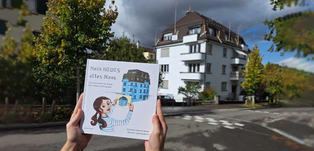
Released on 23rd October 2024
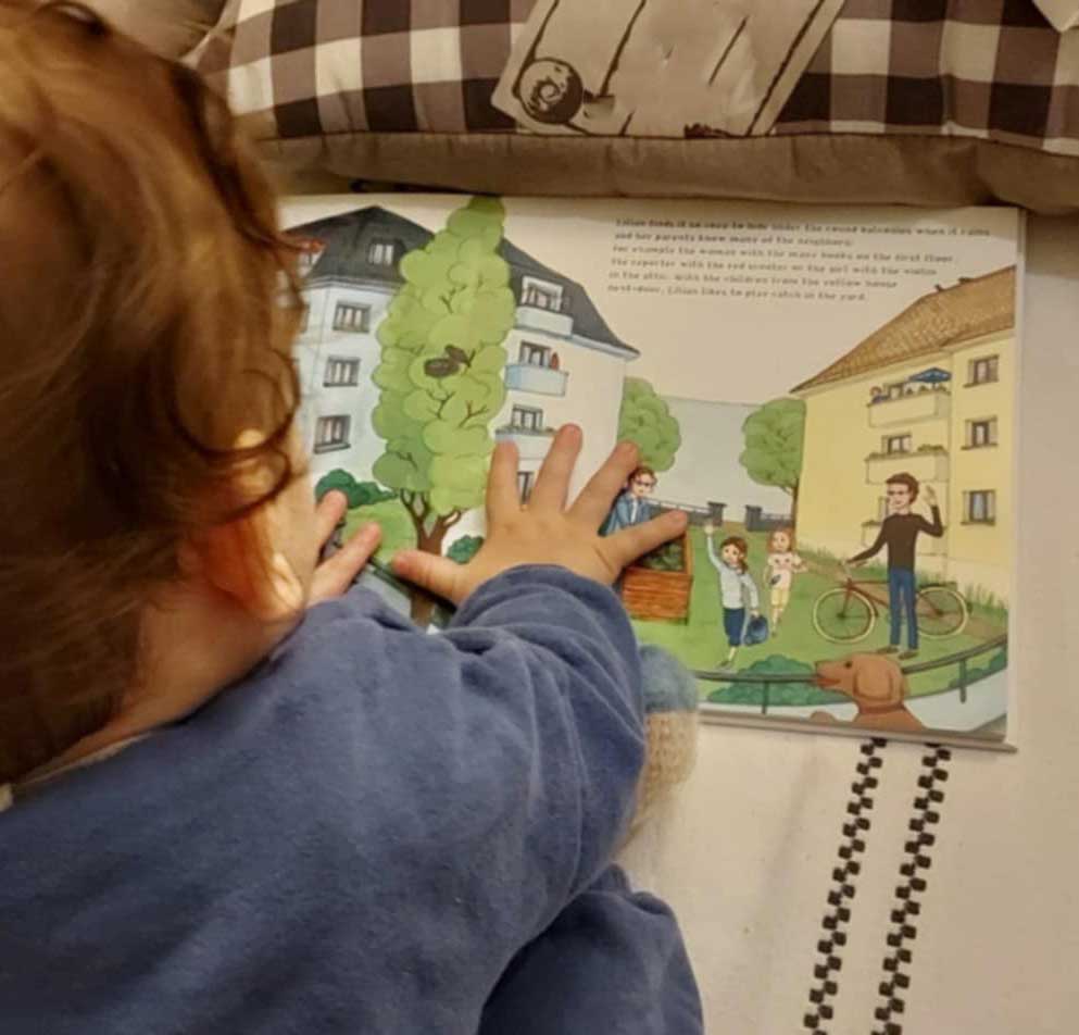
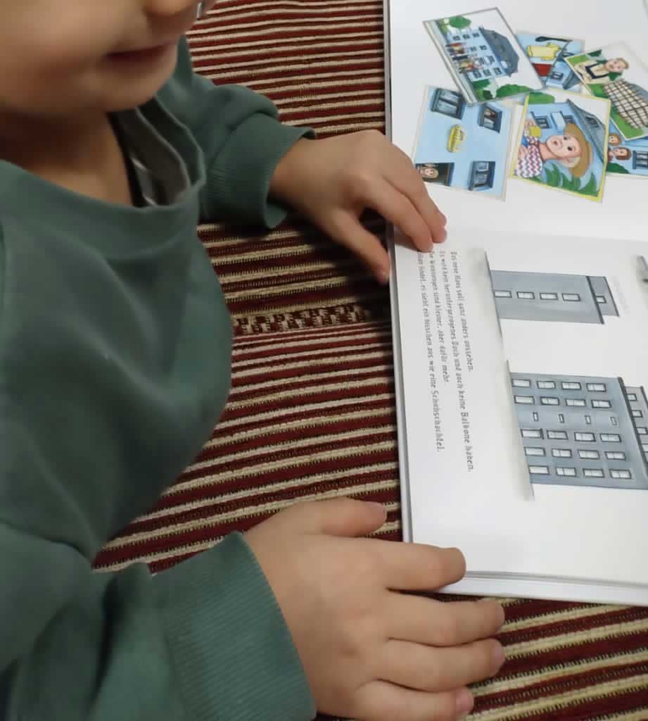
A children's book about renovation instead of new construction. This book tells the story of little Lilian, whose light blue house is to be demolished. But then Lilian wonders why we don't repair our houses first and she writes a letter to the owner. Here the topic of sustainability and transformation in architecture is carefully brought closer to children.
With text and typography by Korinna Zinovia Weber and hand-painted illustrations by Meruert Zharekesheva.
Hardcover 21 x 21 cm, thick paper inside, 18 pages. Available in seven languages. For children age 4+.
All the editions are available online here at ARCHITECHNE. After ordering, your copy will be printed and send directly to your home. Please note that the book is coming per default as a registered letter. Depending on your location the delivery can take up to 18 days.
For booklovers in Switzerland: We recommend to buy the German version of the book via Ricardo or via the bookstore Hochparterre Bücher Zürich or write us an email (also for other language editions) - we printed a handful number of copies in advance and can ship within Switzerland.
We are aware that for some destinations, the shipping costs are extremely high because of the registered letter policy from the printing service. Get it touch with us, we will find an individual solution for you!
German Edition "Mein NEUES altes Haus" (ISBN 978-3-9526113-0-2)
Turn PDF into bookFrench Edition "Ma NOUVELLE ancienne maison" (ISBN 978-3-9526113-1-9)
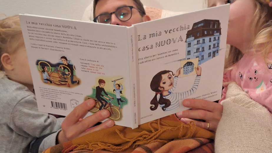
Turn PDF into bookItalian Edition "La mia vecchia casa NUOVA" (ISBN 978-3-9526113-2-6)
PDF to book printEnglish Edition "My NEW old house" (ISBN 978-3-9526113-3-3)
PDF to books printGreek Edition "Το ΝΕΟ παλιό σπίτι μου" (ISBN 978-3-9526113-4-0)
PDF to magazine printDutch Edition "Mijn NIEUWE oude huis" (ISBN 978-3-9526113-5-7)
PDF print hardcover bookHungarian Edition "Az én ÚJ régi házam" (ISBN 978-3-9526113-6-4)
PDF to book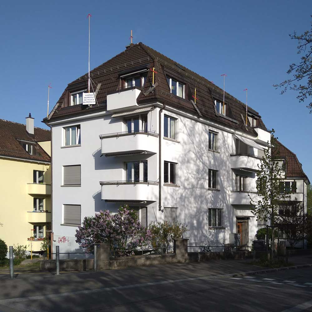
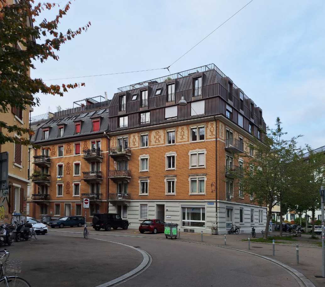
Somewhere in Switzerland there is a four-story apartment building located with a mansard roof, built in 1938 - a typical local architecture for its time. In 2023 it was announced that it is going to be demolished and replaced with a new building that offers exclusively tiny rooms (9m²) to students. The owner's decision took the residents by surprise. Some of the families had just moved in, including a young family with a newborn. While they demonstrated against housing shortages their case made it into the local newspapers. This demolition is just one of many in Switzerland but also in other countries where gentrification forces locals out of their neighbourhood. This inspired the author to write a children's book on the topic:
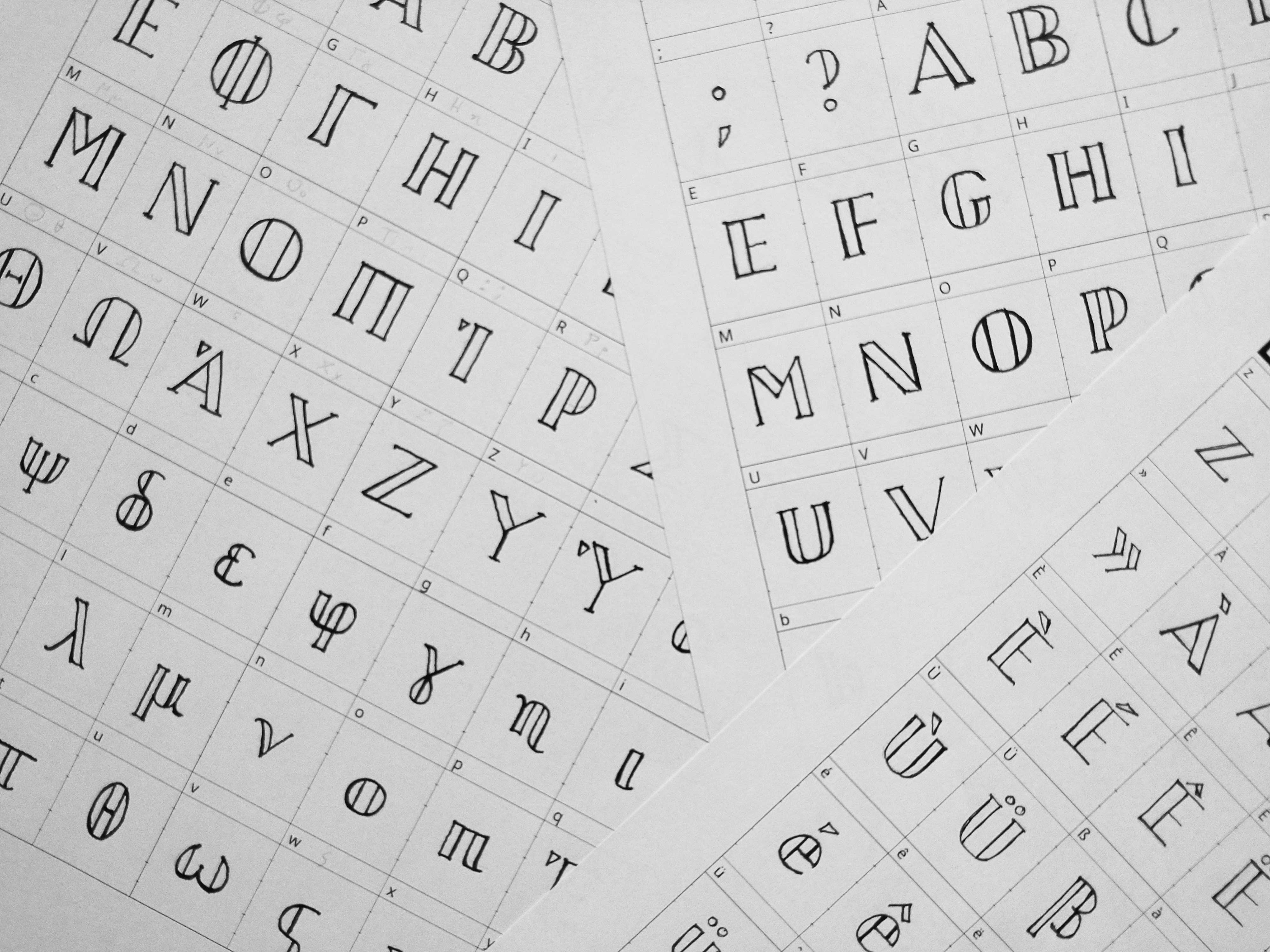
For the book Korinna was looking for a font that should fit the character of the building from 1938 but that should also be individual and licence-free to ease their small budget. While researching on the building, she stumbled upon a historic photograph from 1940 where a relief was figuring next to the entrance indicating the name of the house but that doesn't exist anymore today. Inspired by this relief, she wrote by hand the alphabet, scanned it, ran it though a software and the font "Langenrain" for the book was born.
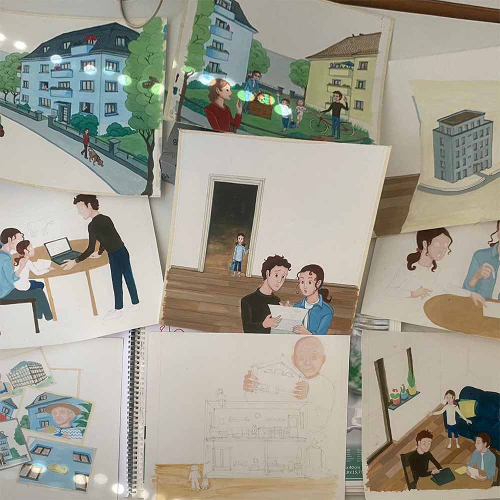
After writing the story and sketching a rough storyboard, Korinna Zinovia Weber contacted Meruert Zharekesheva, who is both an architect and a real talent in figurative painting.
An important first step in the illustration process was to develop a character sheet.
Every double-page is designed as a whole. After a small first sketch of each page, the sketches were transferred to a larger format of 30 x 30 cm. The setting is kept very similar to the real surroundings, except for the small difference that the house in question is painted in a light blue color, rather than the original white. To tie the main characters visually to the blue house they also wear at least one blue item of clothing.
The illustrations were hand painted by Meruert in gouache colors within half a year. This medium was chosen due to its opaque and matt finish and soft surface quality. Details were drawn with colored pencils.
The story of the book demanded also the development of two additional architectural designs: both the new construction and the final renovation needed to be conceptualized. A digital 3D-Model was built based on the original plans of the blue house, which then helped with the design and illustration process. The following image is showing a project that was used as a reference for an elevation in an historic context by Frei + Saarinen Architects in Zürich:
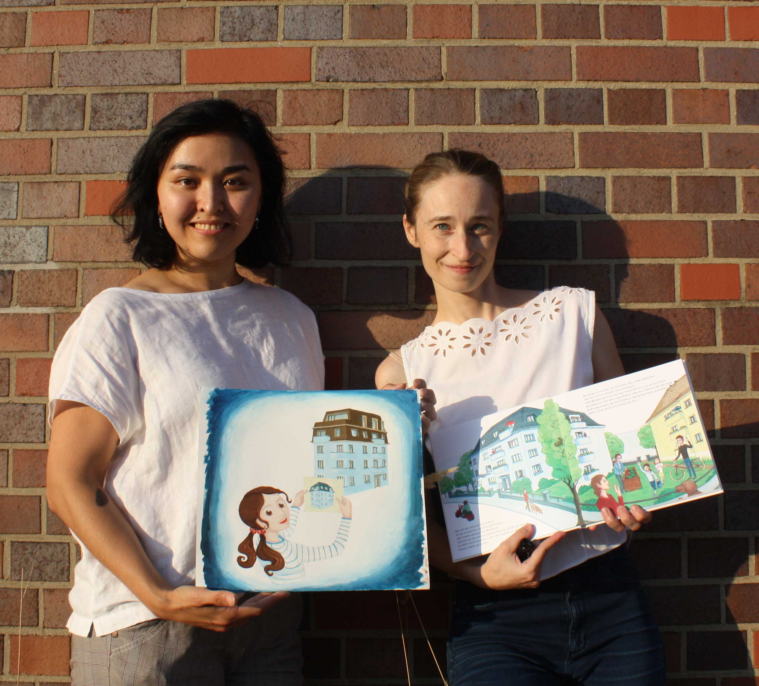
Dr. Korinna Zinovia WEBER wrote this book and designed the font LANGENRAIN, inspired by her neighboring house in Switzerland. She studied architecture in Munich and Paris, later received her doctorate in Lausanne and has since then been interested in, among other things, the history of houses and what they can become in the future. If she isn't currently writing books, she is exploring the world together with her children or dancing ballet.
Meruert ZHAREKESHEVA drew the pictures in this book by hand and painted them with gouache paints. She studied architecture in Munich, Singapore and London. In her everyday life she draws plans for houses and visits construction sites. Almost as much as studying architecture and cities, she loves painting and dancing hip hop or jazz. As a child, she always wanted to tell fairy tales to others and bring characters to life.
Korinna and Meru have been collaborating since their architectural studies on various projects together for more than ten years. This is their first publication together.
The project was partially financed by netzwerk frau und SIA.
The authors are furthermore grateful to Yvan Delemontey, Pia Grünwald, Jessica Wilcox, Max Tirassa, Margherita Dagnino, Hannah van Hove, Márti Szagalyi.
This project started without any budget. This led the authors to experiment with print-on-demand. Nowadays, publishing in the usual way means the authors cover most of the costs as publishing houses don't take anymore the risk of sales. Traditional books are then printed in large quantities far away. Printing hundreds of copies at their own risk didn't really seem sustainable and without any sponsors at the time - despite doing enthousiastic fundraising – the project would have been beyond budget. And printing cheaply on another continent while preaching to children about sustainability... nope.
With ARCHITECHNE, this children's book takes full advantage of print-on-demand: it is only printed when someone actually buys the book, at a partner print shop close to where the book was ordered. The book is then sent directly to the customer by post. And it is published in several languages simultaneously because it is important to read in the native language to a child.
Of course there is a noticeable disadvantage and that is the price of the book. Since the book is only printed individually, the production costs per copy are comparatively high. Buyers will of course feel that and it will put some people off, we are fully aware of this fact.
But think of it that way: You don’t only buy one book, but also a gift for someone in the future. We strongly encourage our readers to pass the book on once the child grew up. It passes the message but you also get more out of your money if you see it as an investment for a gift in the future. We made it with thick pages so with this quality it can last longer. We want to stand behind the message of sustainability - both in the book and with the product itself.
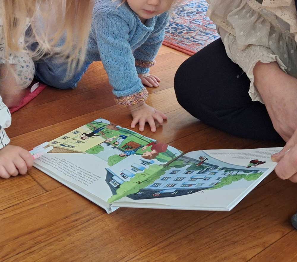
In the near future, we want to offer special packages for schools. Get in touch with us if you want to order several copies for your classroom or if you want to sponsor copies for a school. We can feature your logo in a special edition of the book.
Would you like to get in touch with us?
We speak English, German, French, Italian and Greek.
info[at]architechne.ch